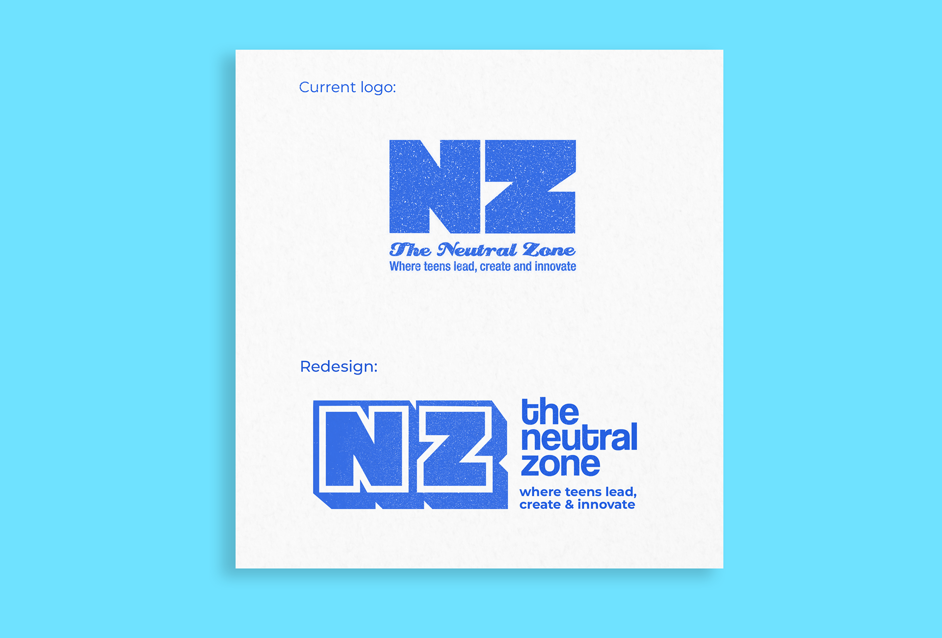
LOGO REDESIGN
For the logo, I decided to redesign their existing NZ logo instead of pushing a new concept. I thought it already had a meaningful place in the organization and just needed a youthful lift and more modern typography to be more appealing to its targeted demographic. I executed this with a more dimensional lettermark and "cooler" typography using the typeface Coolvetica, a fun, playful homage to Helvetica.

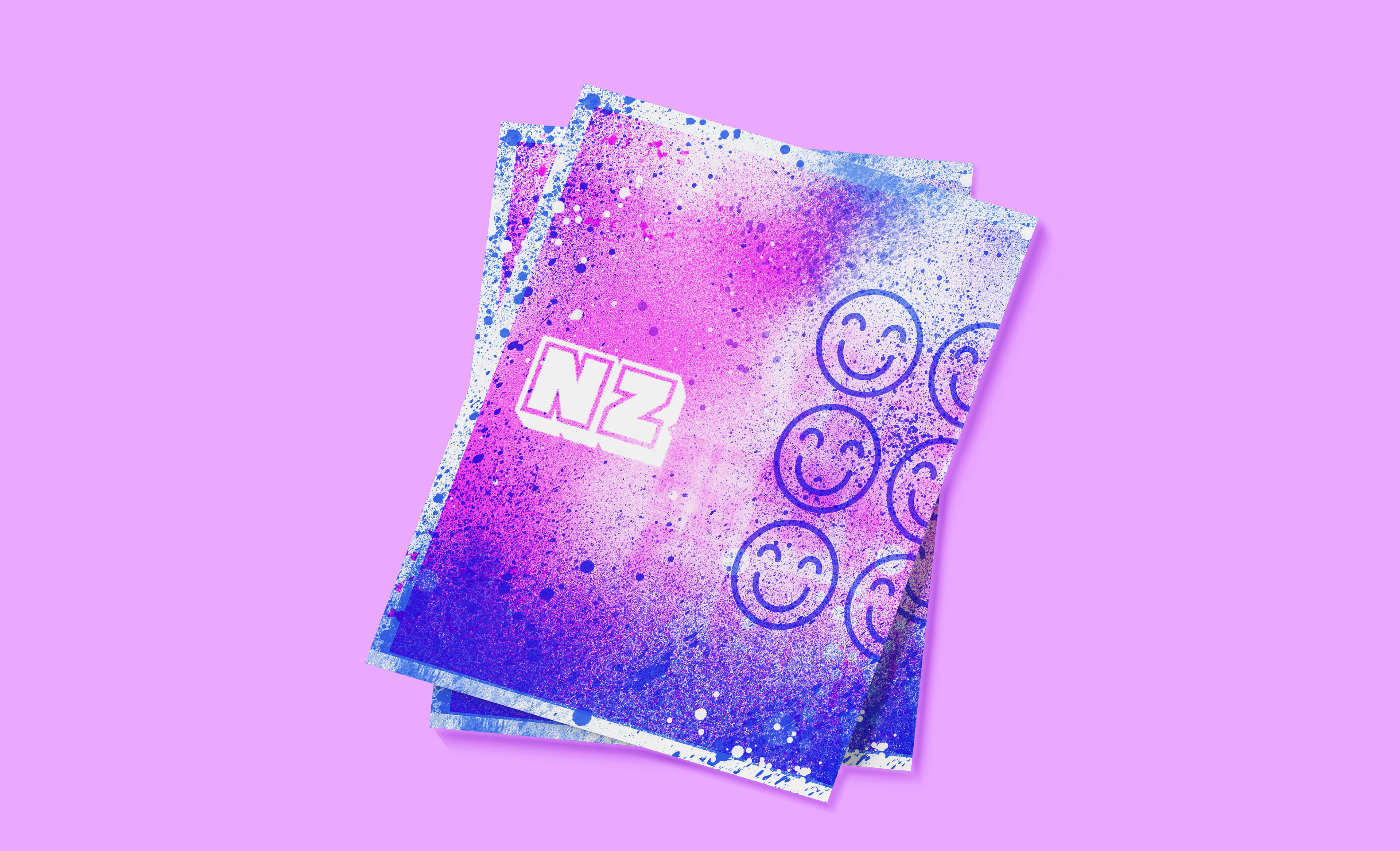
print materials
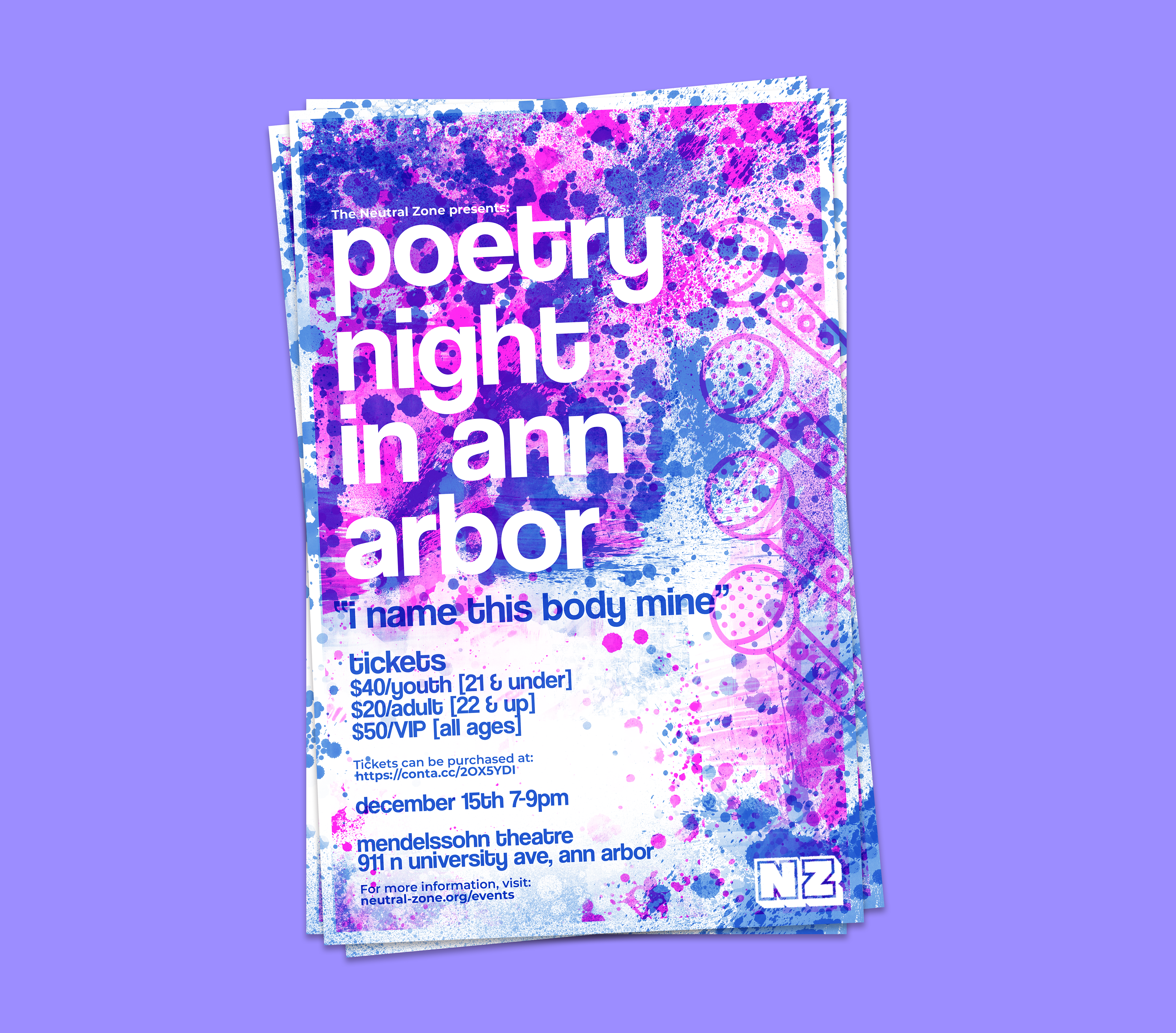
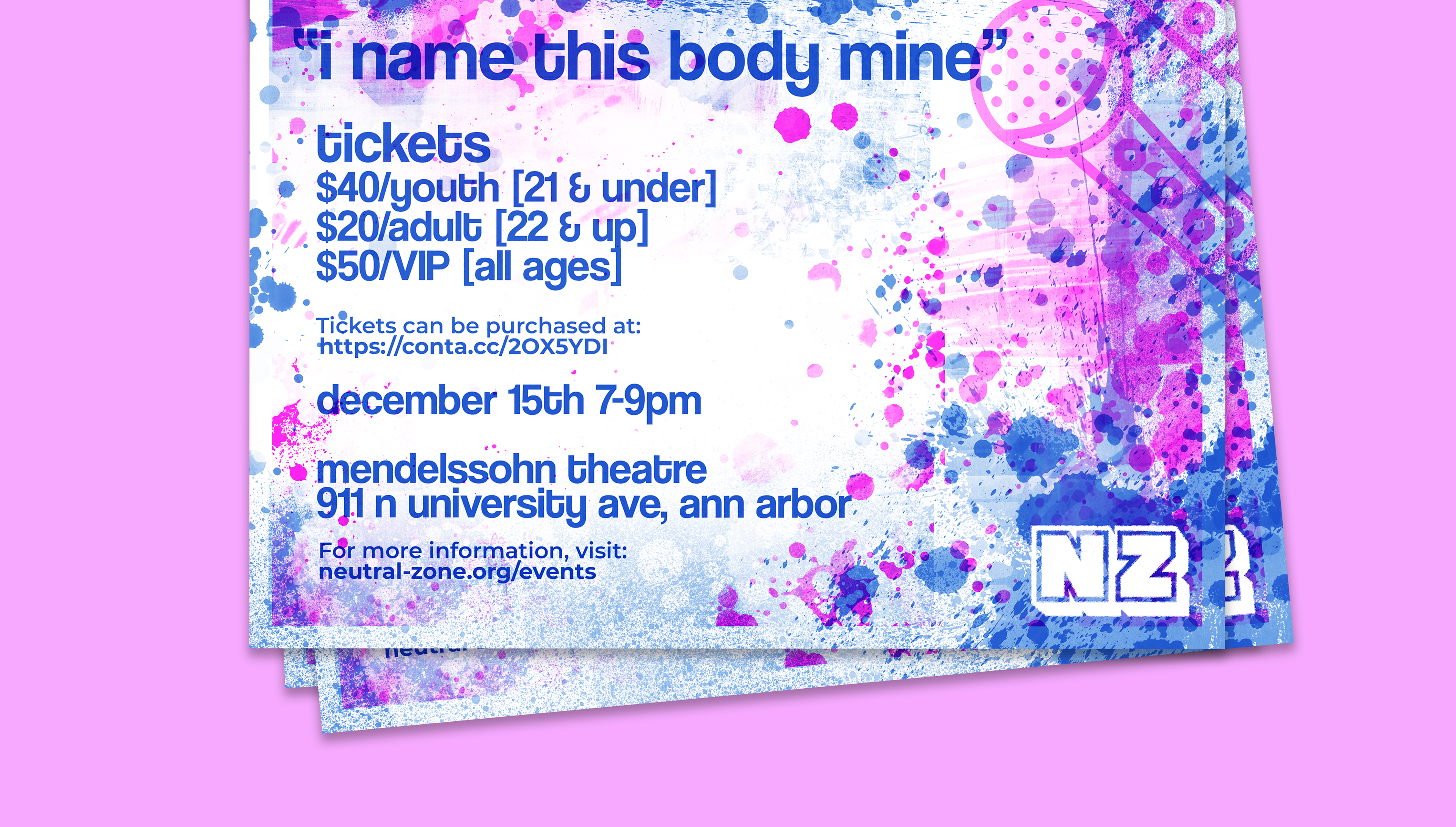
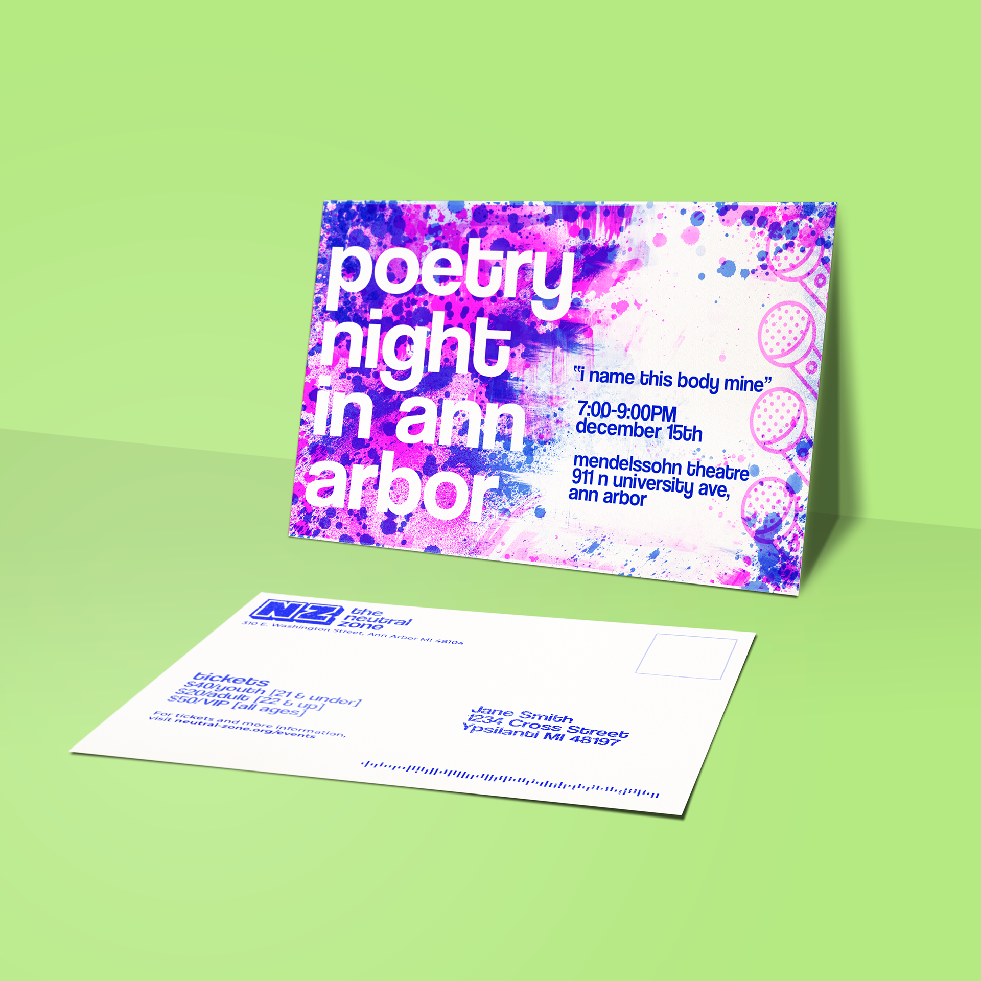
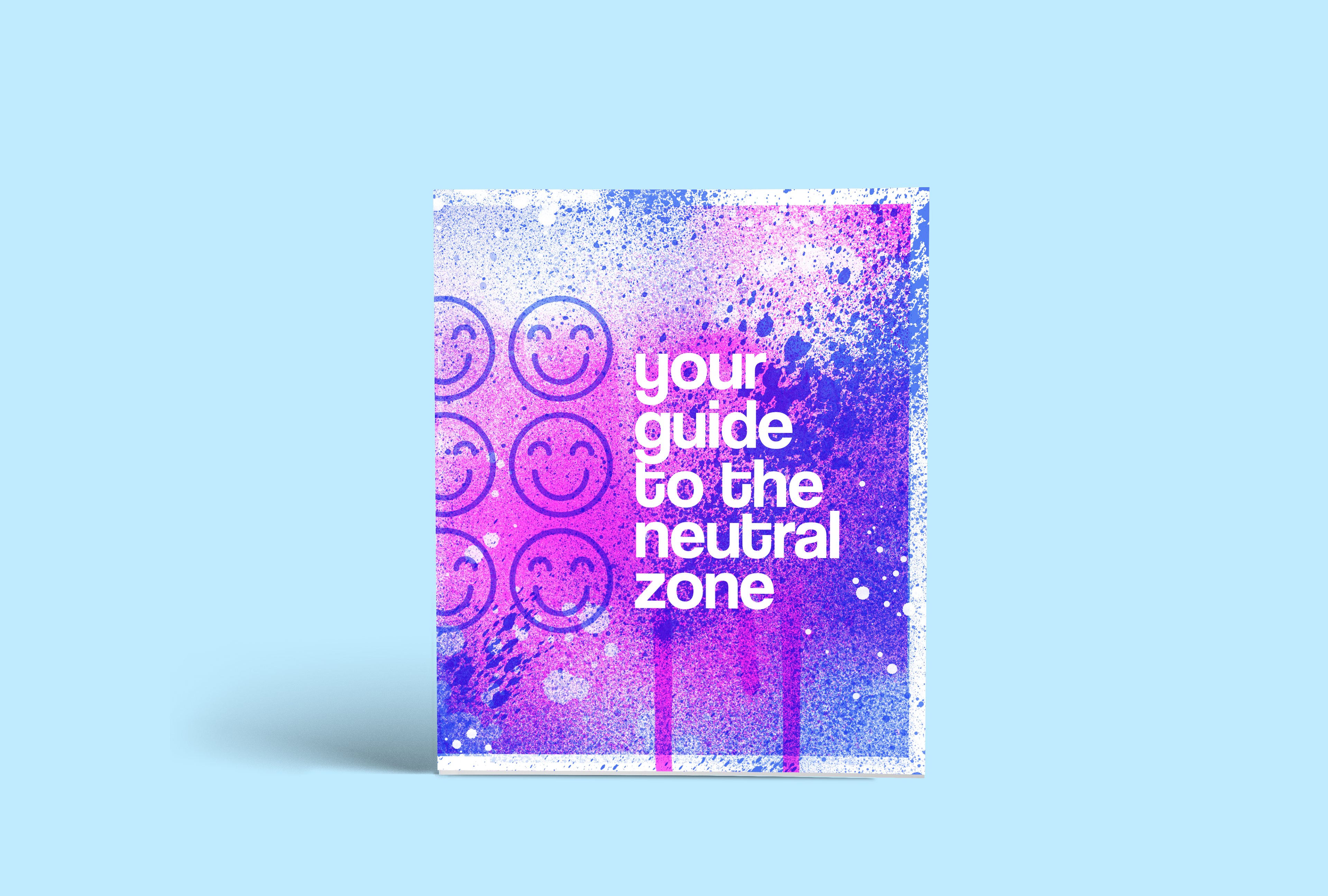
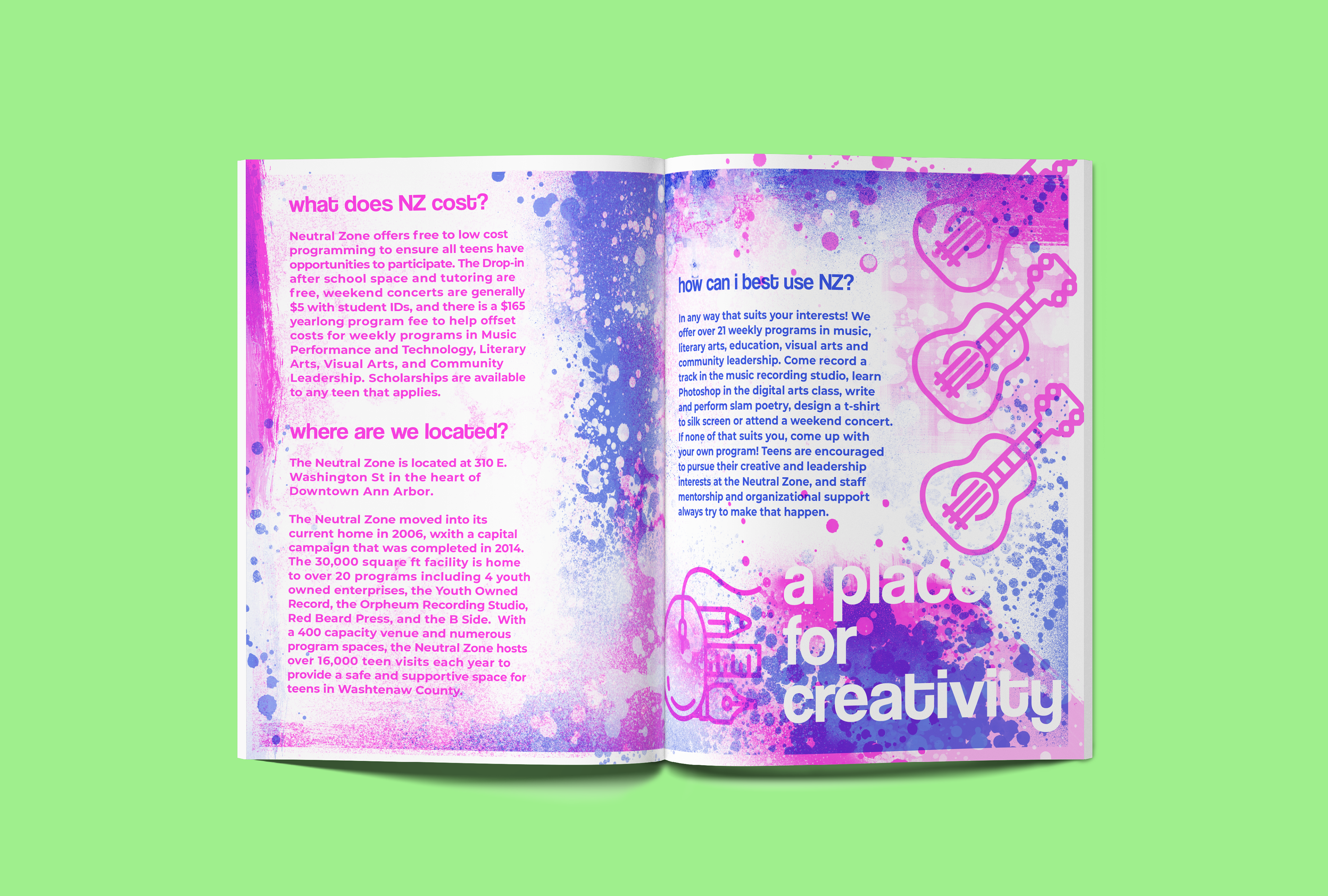
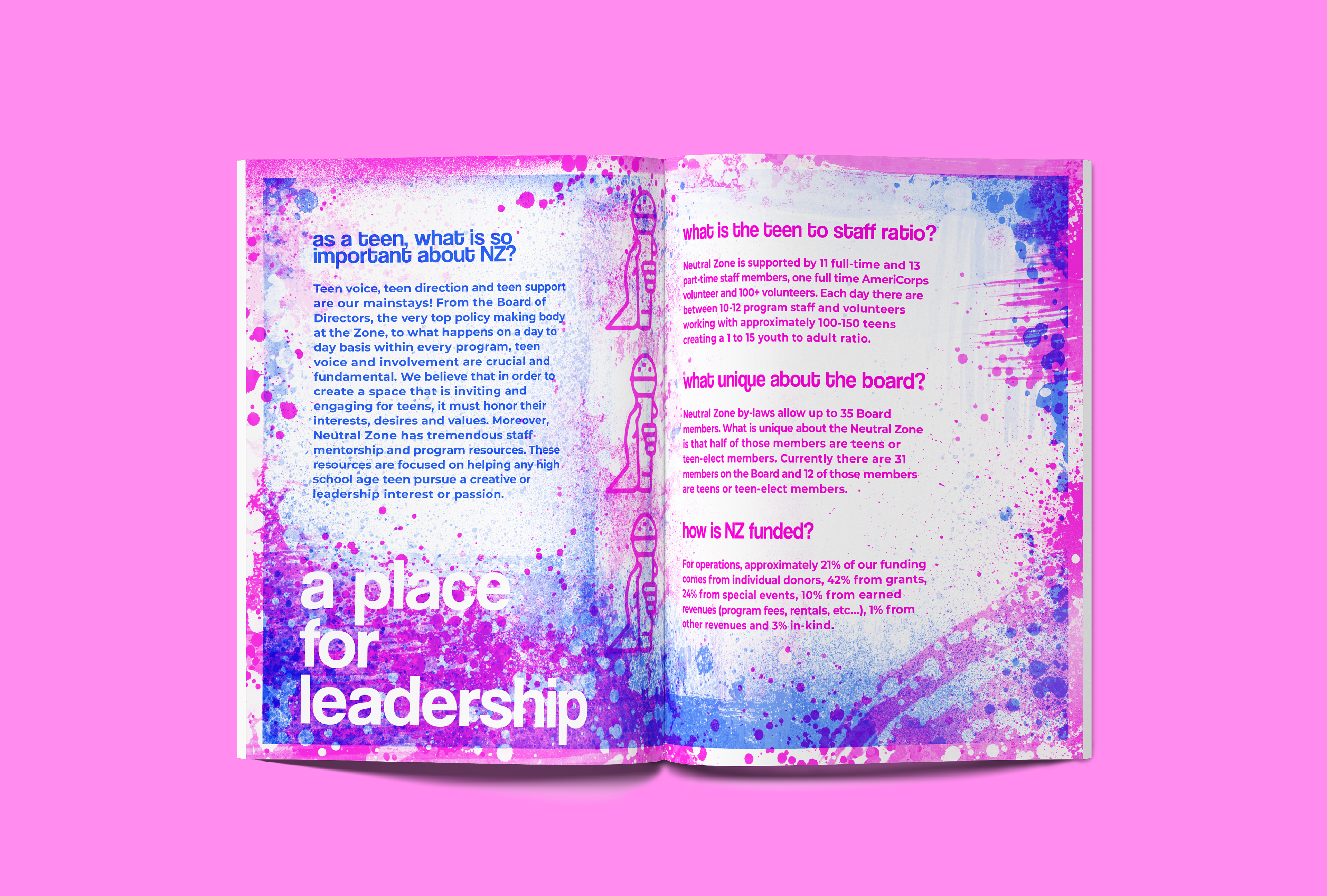
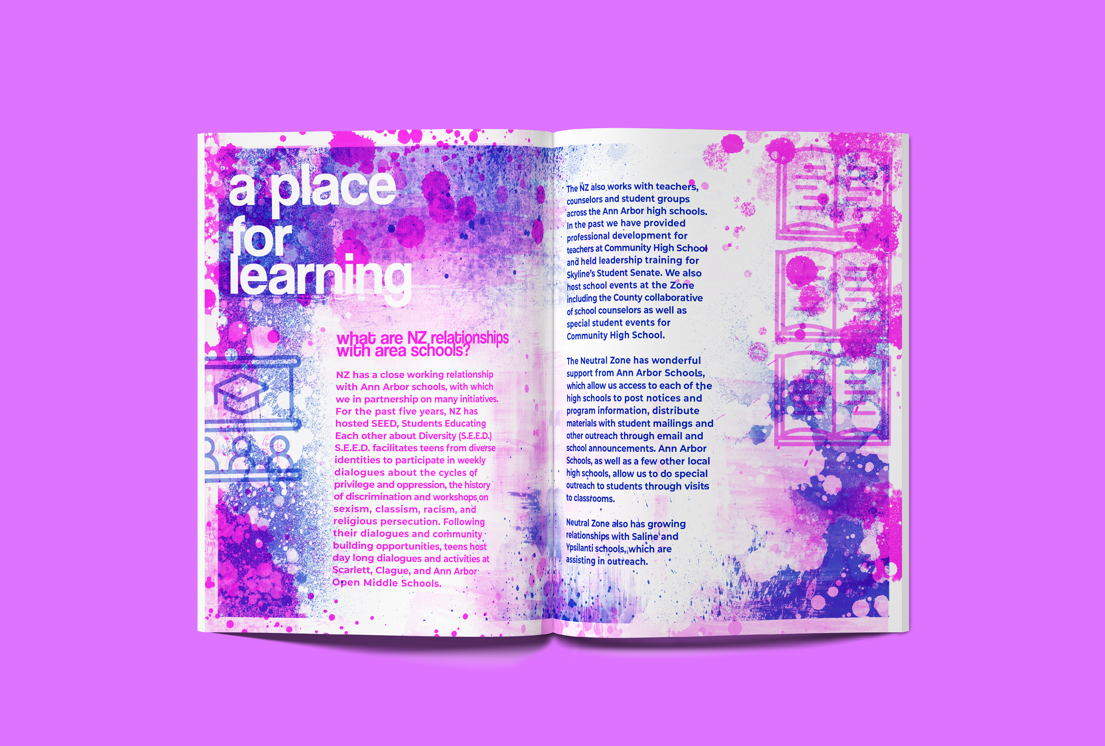
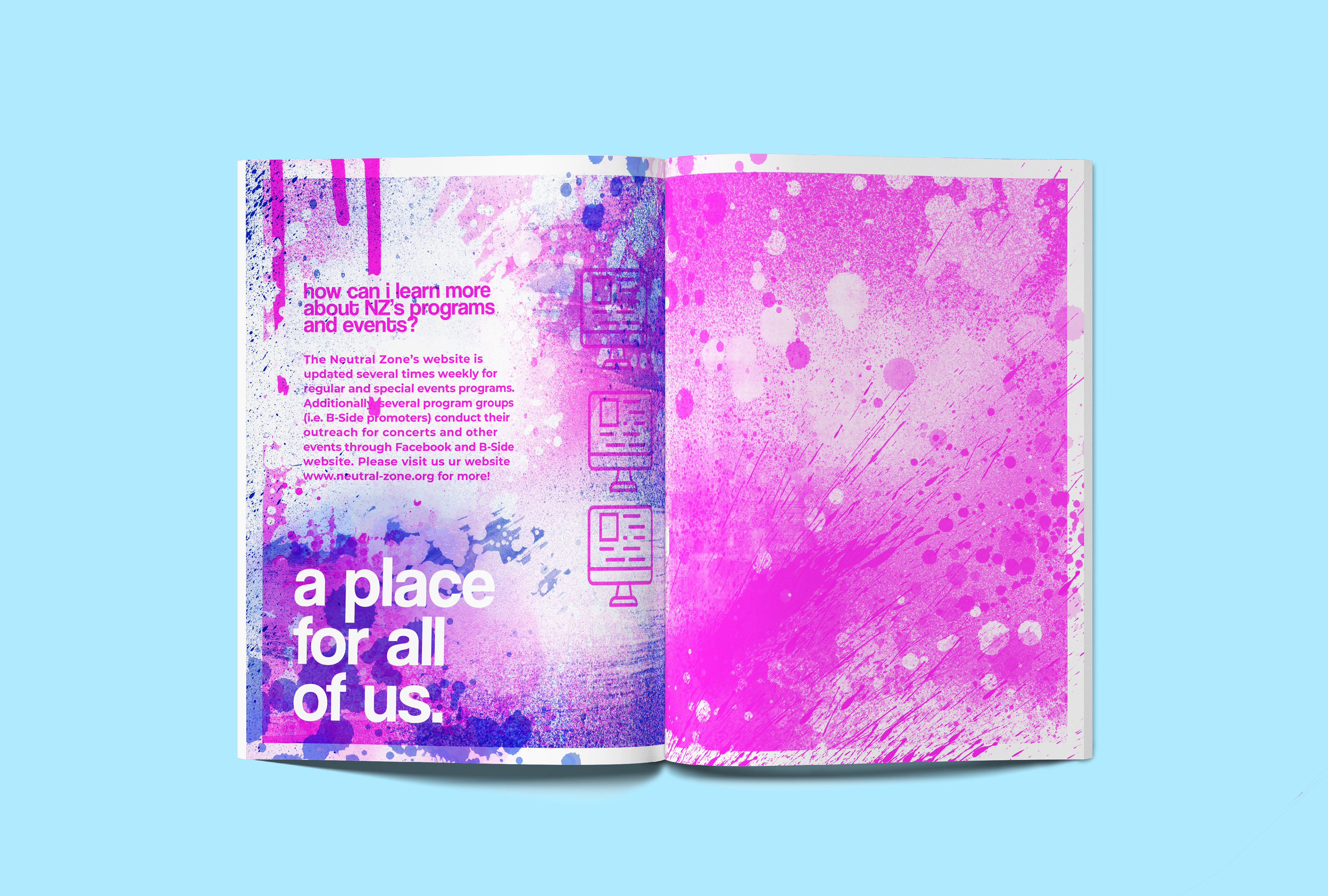
I created all of my printed materials on our school's RISO duplicator, using Fluorescent Pink and Blue inks to create materials that were bright and exciting, hoping to create something recipients would want to hold onto instead of merely toss away.
Each piece and page of the printed materials is a separate digitally painted composition, each created with a variety of paint, grunge, and spray paint brushes in Photoshop. In creating this visual system, I wanted to combine feelings of youthful excitement, the mixing of ideas, and the diversity of opportunity that NZ provides.
(Actual RISO scans coming soon)
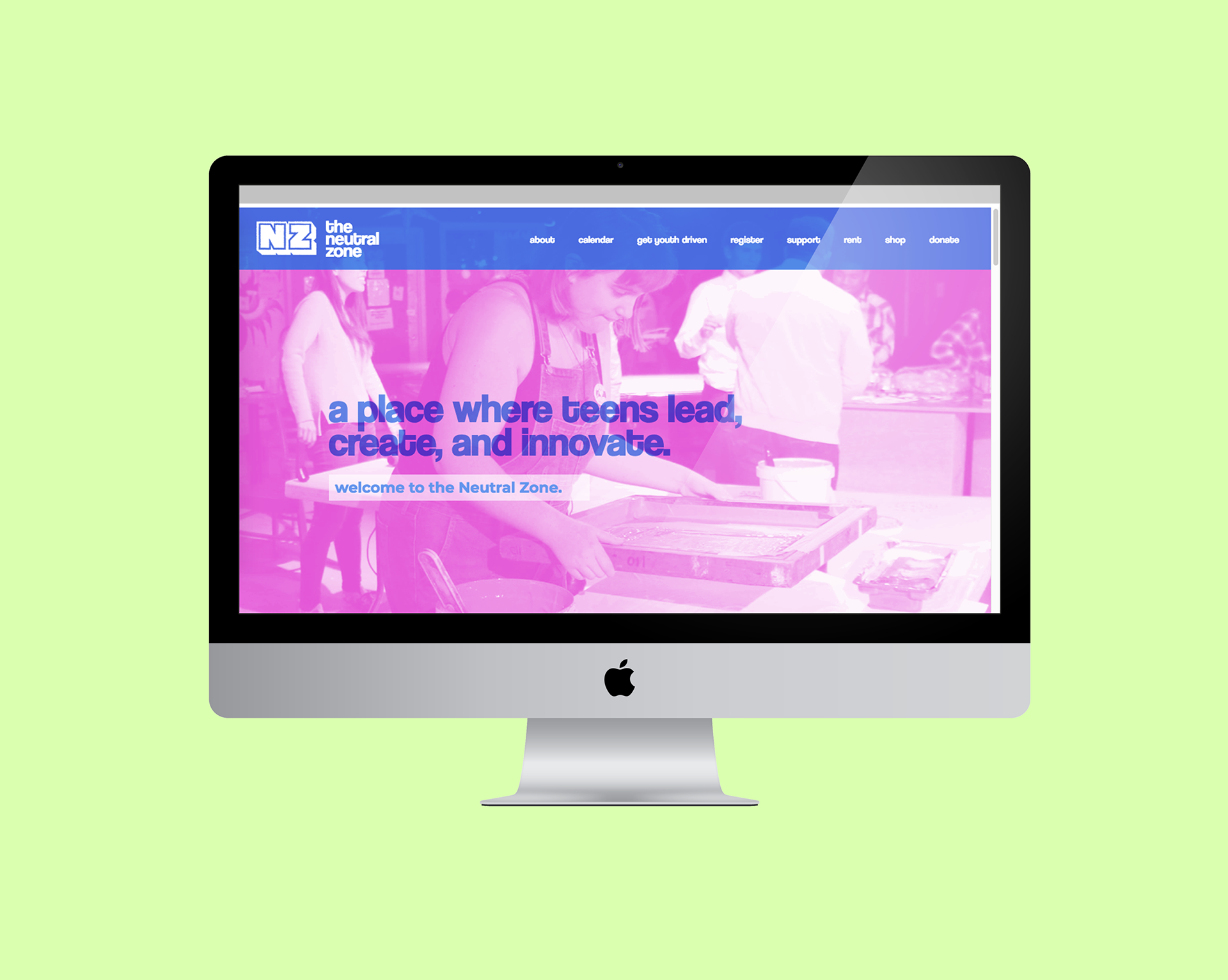
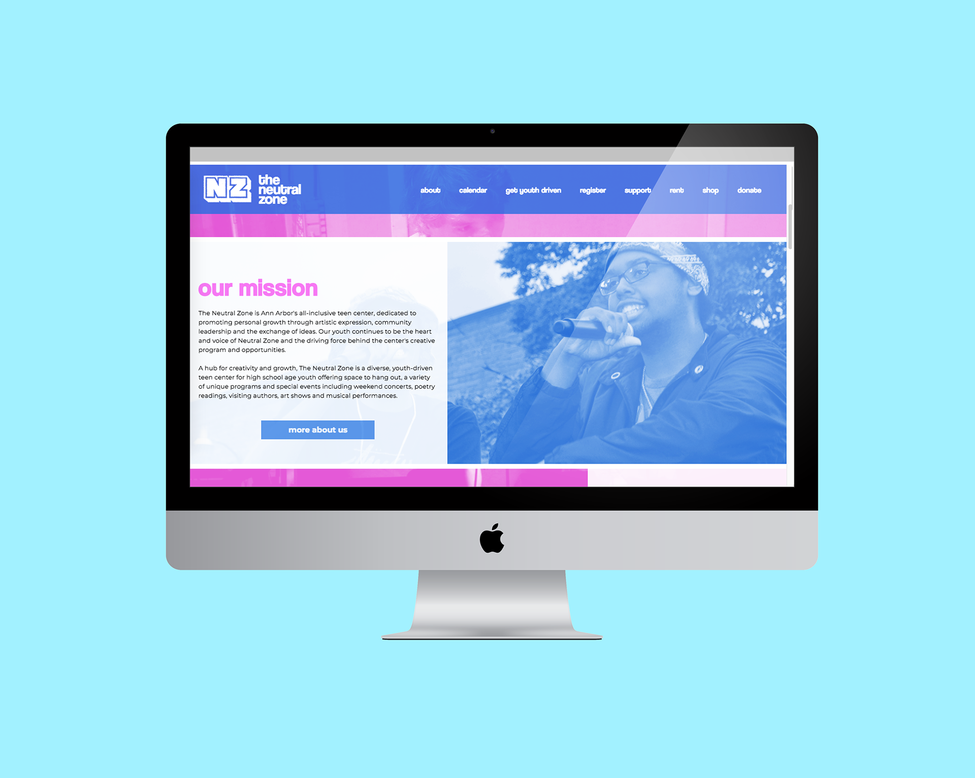
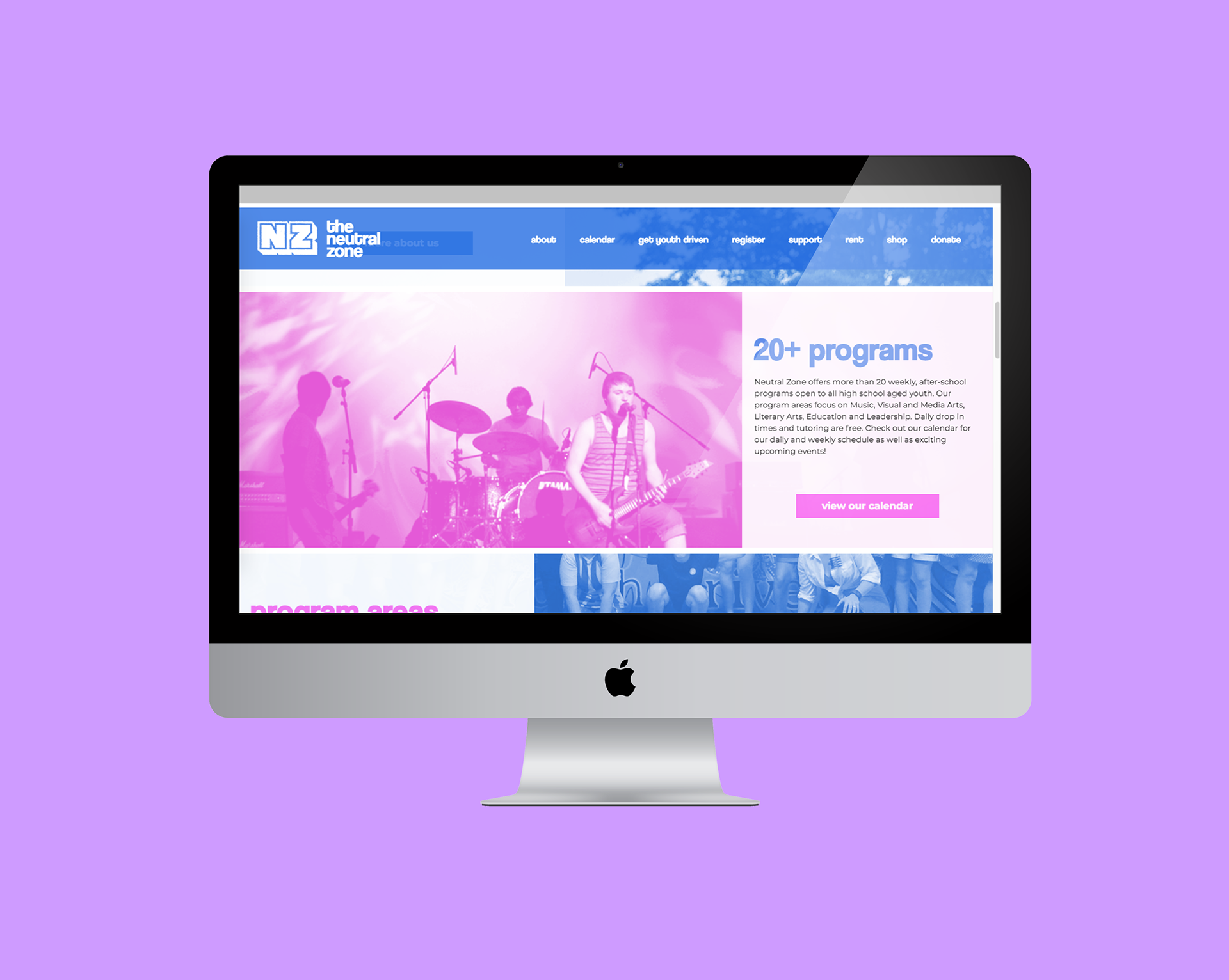
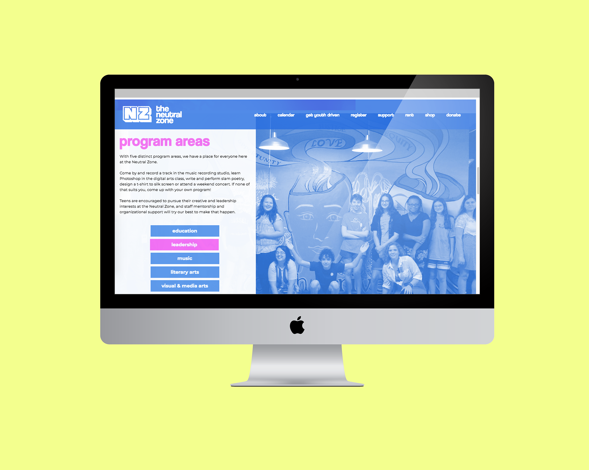
website
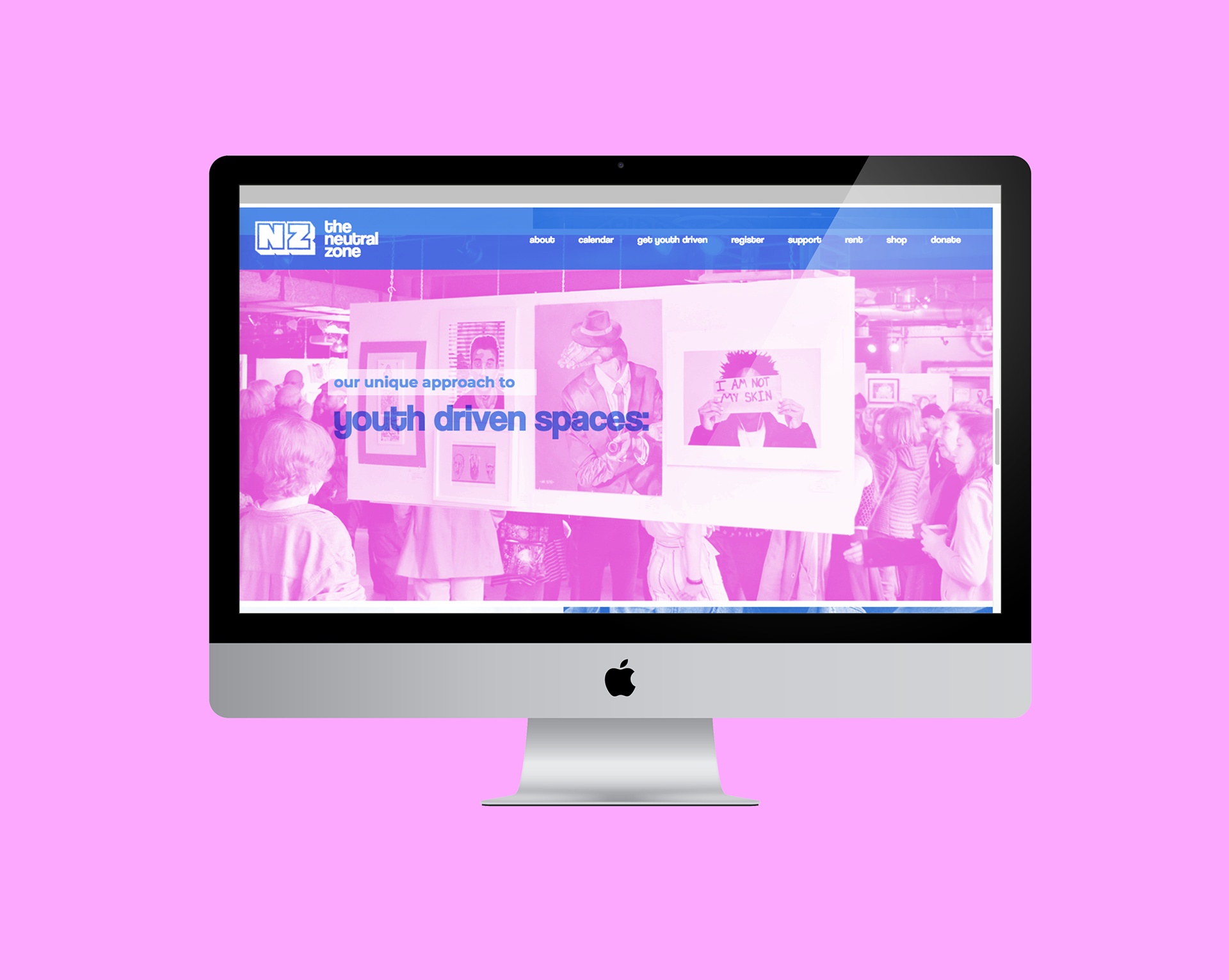
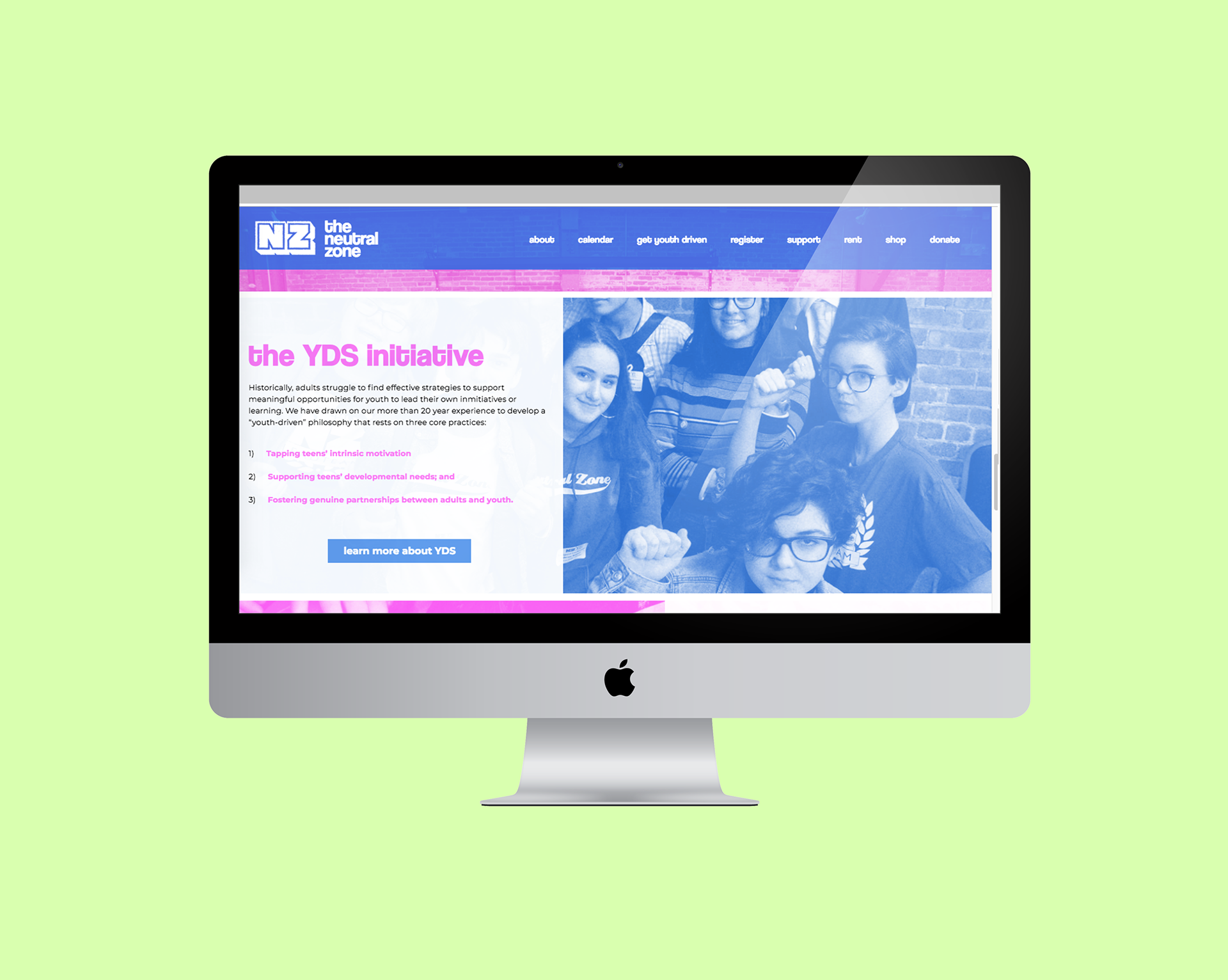
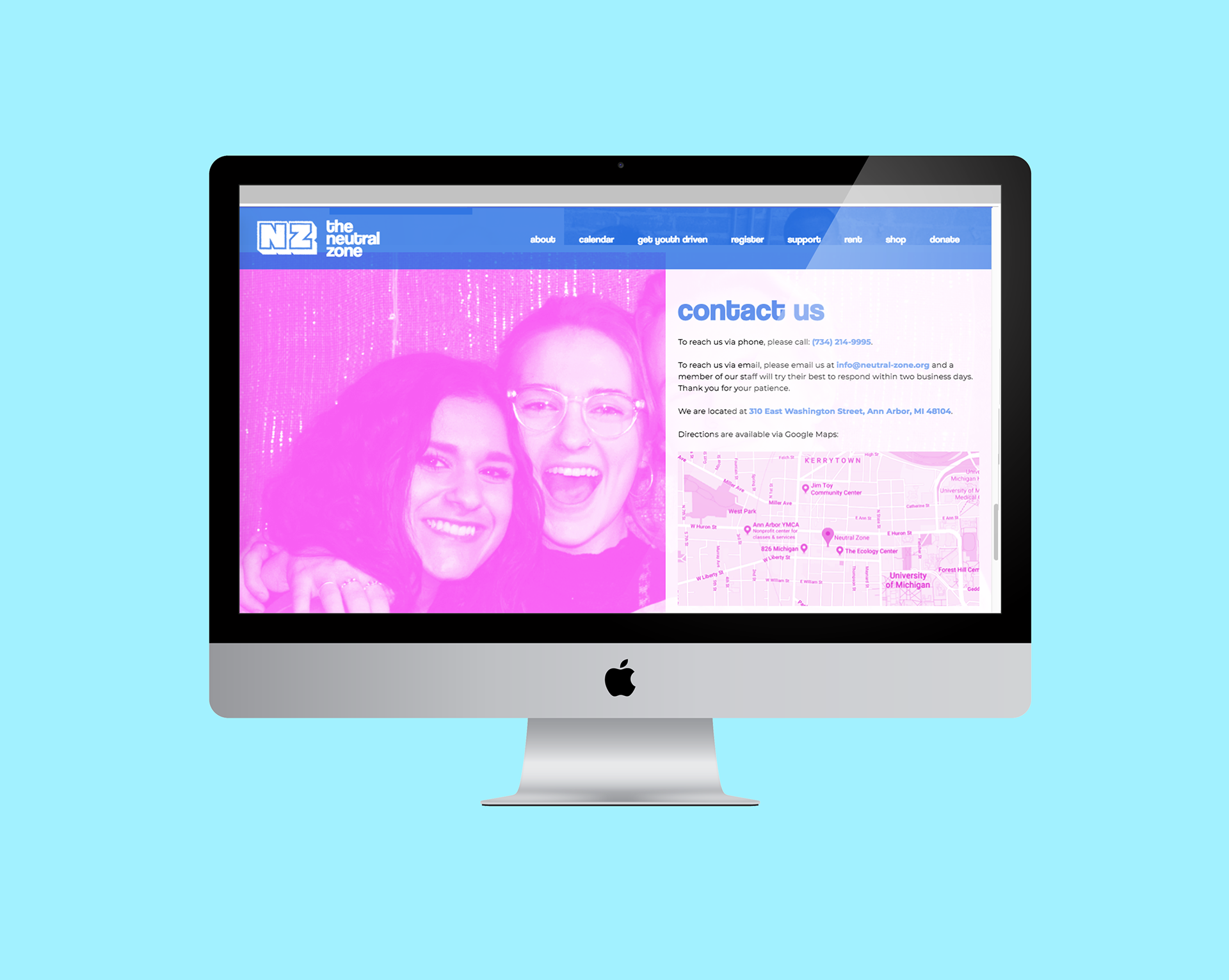
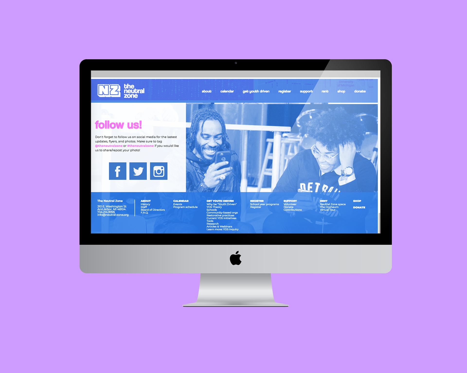
For the final part of the project, I created a scrolling landing page for the center. I decided the website should have a similar feel to the materials but more toned down, clean, and appropriate to web, choosing to keep the bright and attention-grabbing colors and adopting a variety of photos from the Neutral Zone. While the booklet's graphics could remain timeless, the website could be kept updated with photos from current NZ teens.
I used text overlays, scrolling parallax photos, and color-changing hovers to bring in a similar youthful excitement from the printed materials. The website was fully coded in Dreamweaver.